๐Ÿ”’
Case Study 02

Catch the Ghost Cloud

This case study is password protected. Enter the password to continue.

Incorrect password โ€” try again.
Need access? Reach out โ†’
โ† Adekemi Borode Catch the Ghost โ€” Cloud
Case Study 02 โ€” SaaS / Web App

Catch the Ghost Cloud

Building a scalable content management platform for the team behind the app.
Role
Lead Product Designer
Team
2 Designers
Platform
Web App (SaaS)
Focus
UX ยท IA ยท Workflow Design
Status
Shipped
cloud.catchtheghost.com
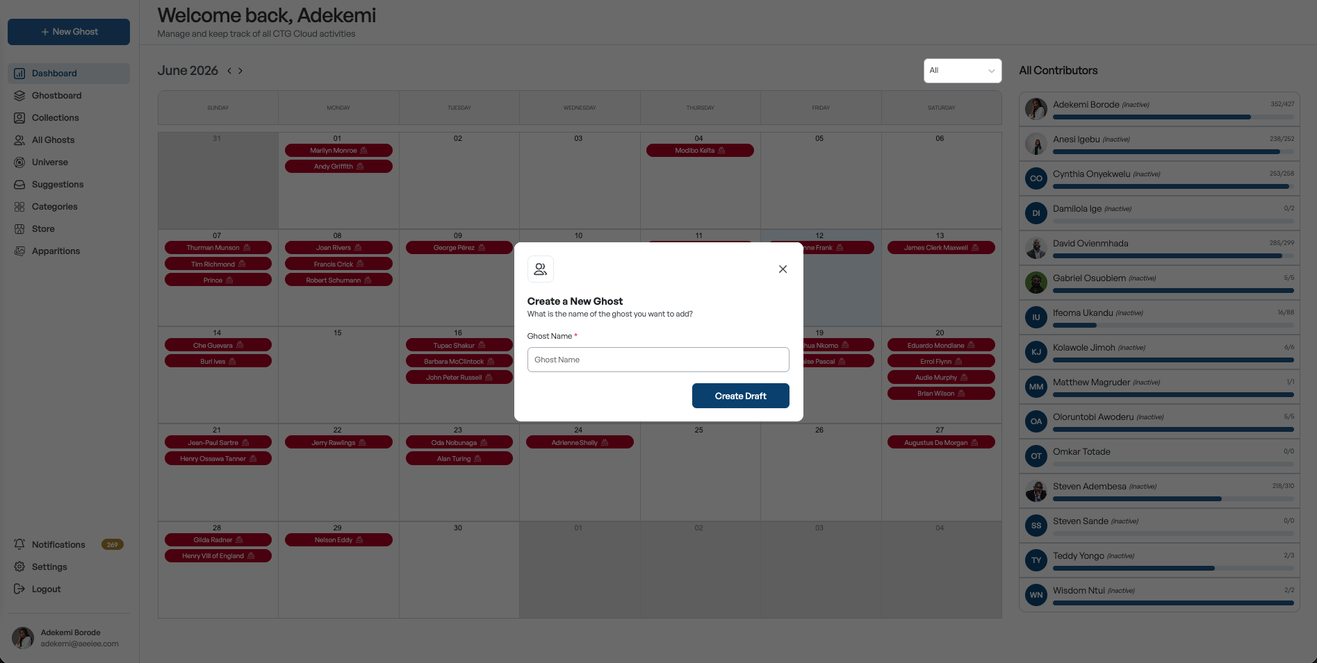
Catch the Ghost Cloud dashboard

Behind every Ghost in the app is a rich library of content โ€” biographies, images, quotes, collections, and metadata. Cloud is where the team creates it.

Catch the Ghost Cloud is the internal platform editors and contributors use to create, review, organize, and publish content. As the library grew, managing it became increasingly complex. I led the redesign of the Ghost management experience โ€” improving content creation workflows, collaboration, and information architecture.

Understanding who uses Cloud

Before redesigning, I mapped the workflow through a real contributor's experience. This persona and journey map shaped every design decision that followed.

Nkechi Okonkwo
Nkechi Okonkwo
Content Contributor
CTG Cloud
RoleContributor
TeamContent
Ghosts/day3โ€“5

"I'm trying to get as many ghosts done as possible before the deadline โ€” the last thing I need is to lose time just trying to open one."

Nkechi is a history graduate who joined the CTG content team to research, write, and manage historical figure data. She works across multiple collections daily, collaborating with reviewers who approve entries before they are published to the app. Speed and clarity matter โ€” she needs to move through tasks without losing context.

Goals
โœ“Complete entries accurately and avoid review rejections
โœ“Edit ghost content from wherever she is in the app
โœ“Know clearly what actions she is permitted to take
โœ“Receive feedback specific enough to act on immediately
โœ“Track progress and know at a glance what needs attention
Frustrations
โœ•Spotting a ghost that needs fixing means navigating all the way back to find it
โœ•Reviewer comments don't say which ghost or section needs fixing
โœ•No way to tell what is complete until submission gets rejected
โœ•The Collaborator label gives no clue about what she can or cannot do
Pain points Excessive context switching Fragmented collaboration Unclear progress tracking Confusing ownership
User Journey Map

Nkechi's experience across the ghost creation workflow โ€” before the redesign, showing where friction built up.

Emotional arc across the workflow
๐Ÿ˜Š Positive ๐Ÿ˜ Neutral ๐Ÿ˜• Confused ๐Ÿ˜ค Frustrated
01
Start a task
02
Locate the ghost
03
Edit ghost content
04
Track progress
05
Receive feedback
06
Understand roles
07
Submit for review
User action
Identifies a ghost that needs updating โ€” spotted while browsing Collections or the Universe.
Needs to access the ghost's data; navigates away from the current page to find it.
Opens the ghost and fills in or updates fields across five sections.
Tries to understand what's complete, what's missing, and what still needs attention.
Receives a reviewer's comment and tries to understand exactly what needs fixing.
Attempts an action and isn't sure if she has permission to do it.
Believes all sections are done and submits the ghost for review.
Thinking
"I can see this ghost right here โ€” I just need to make a quick change."
"I have to go back to the Ghostboard, search for it, then open it. That's so many steps."
"I've filled in profile and biodata. What sections are left? Where do I check?"
"I think I'm done but I have no way of knowing until I try to submit."
"The comment says 'update the description' โ€” but which ghost? Which section?"
"It says I'm a Collaborator. Can I edit, or only view?"
"I hope I haven't missed anything. There's no way to verify before I send."
Emotion
๐Ÿ˜Š Confident
๐Ÿ˜• Disrupted
๐Ÿ˜ค Uncertain
๐Ÿ˜ค Frustrated
๐Ÿ˜ค Confused
๐Ÿ˜ค Frustrated
๐Ÿ˜Š Relieved
Pain point
โ€”
โš  Ghost data inaccessible โ€” editing required navigating back to the Ghostboard to search and open the record.
โš  No visibility into section completion โ€” users couldn't tell what was filled in vs. missing.
โš  No progress indicators โ€” completion was invisible until submission was attempted and rejected.
โš  Comments lived separately โ€” feedback was vague and disconnected from the content.
โš  The Collaborator label didn't communicate permissions, causing hesitation and workarounds.
โ€”
Opportunity
โ€”
โœ“ Ghost names become clickable anywhere โ€” a modal opens in place for edits without leaving the page.
โœ“ Five labelled sections with completion tracking guide contributors through each requirement.
โœ“ Checkmarks show completion at a glance; submission gated until all sections are marked done.
โœ“ Comments move into a contextual sidebar on each ghost record โ€” visible while editing.
โœ“ Roles displayed with avatars โ€” Creator, Assignee, Collaborator, Reviewer, Publisher.
โ€”
Emotion
Positive Neutral Frustrated
โš  Pain point โœ“ Opportunity

Creating a Ghost was never a simple form

Each Ghost holds many layers โ€” profile, biodata, collections, apparitions, quotes, and more. As content grew, contributors managed increasing amounts of information while collaborating with reviewers and publishers. A UX review and creator feedback surfaced clear problems slowing everyone down.

01
Fragmented collaboration
Comments lived separately from the content being reviewed.
02
Excessive context switching
Contributors left their task to perform simple actions.
03
Unclear progress tracking
Limited visibility into what was done vs. what remained.
04
Confusing ownership
Roles and responsibilities weren't clearly represented.

Much more than entering a name

Because content is reviewed by multiple contributors before publication, the workflow had to support both content creation and collaboration.

Create Ghostโ†’ Profileโ†’ Biodataโ†’ Collectionsโ†’ Apparitions & Quotesโ†’ Submit for Reviewโ†’ Publish to App

Breaking complex content into manageable sections

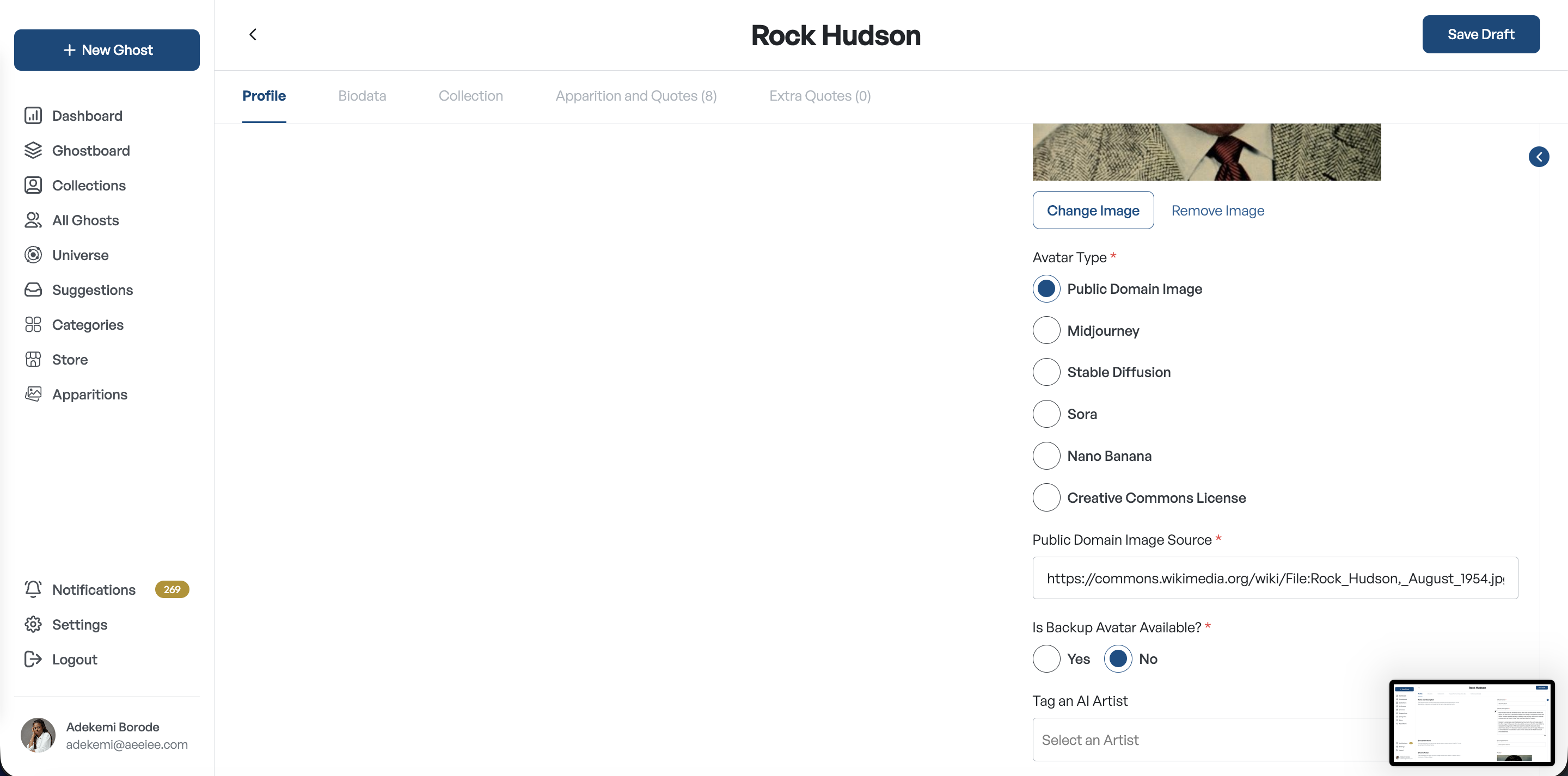
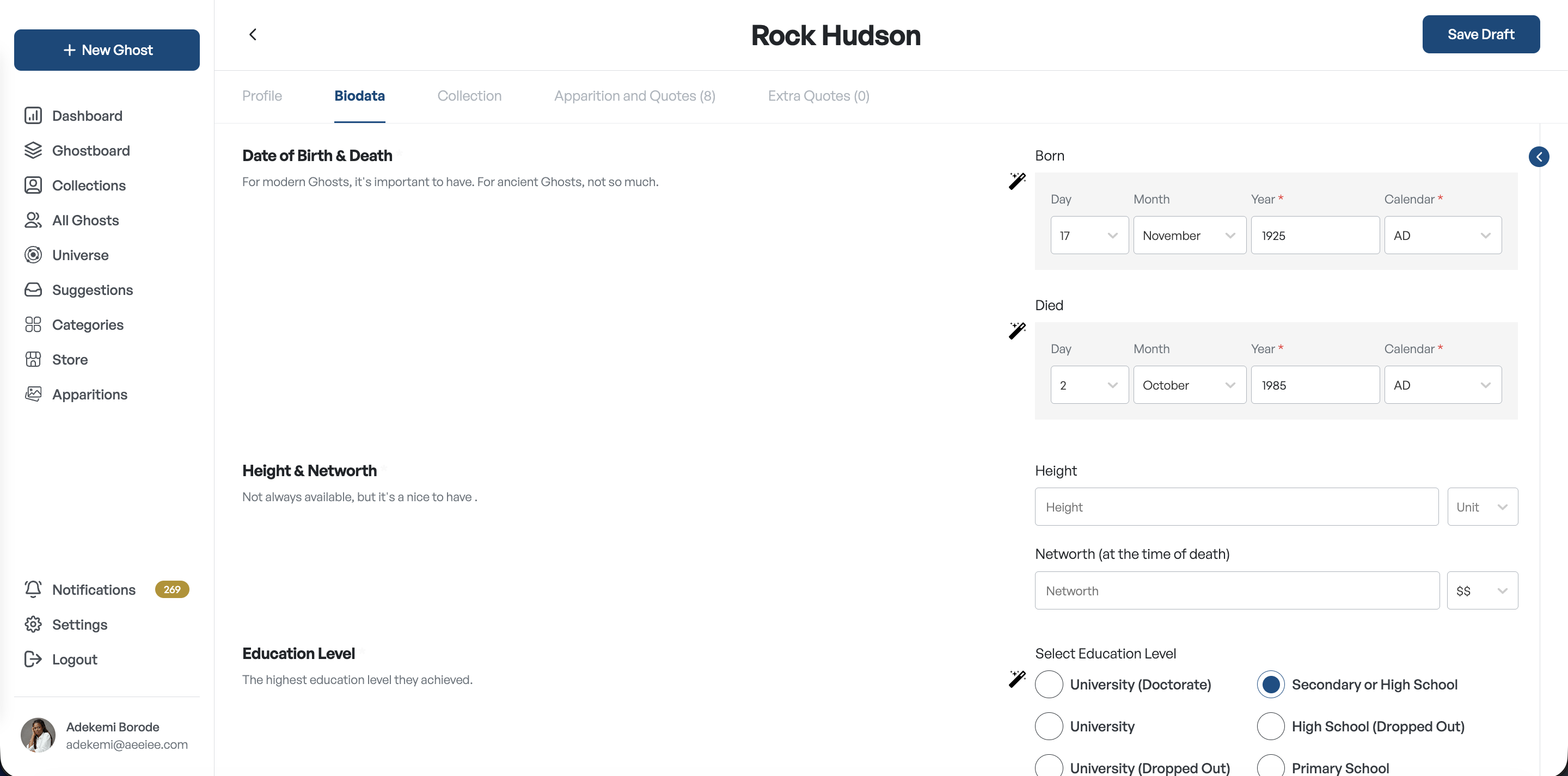
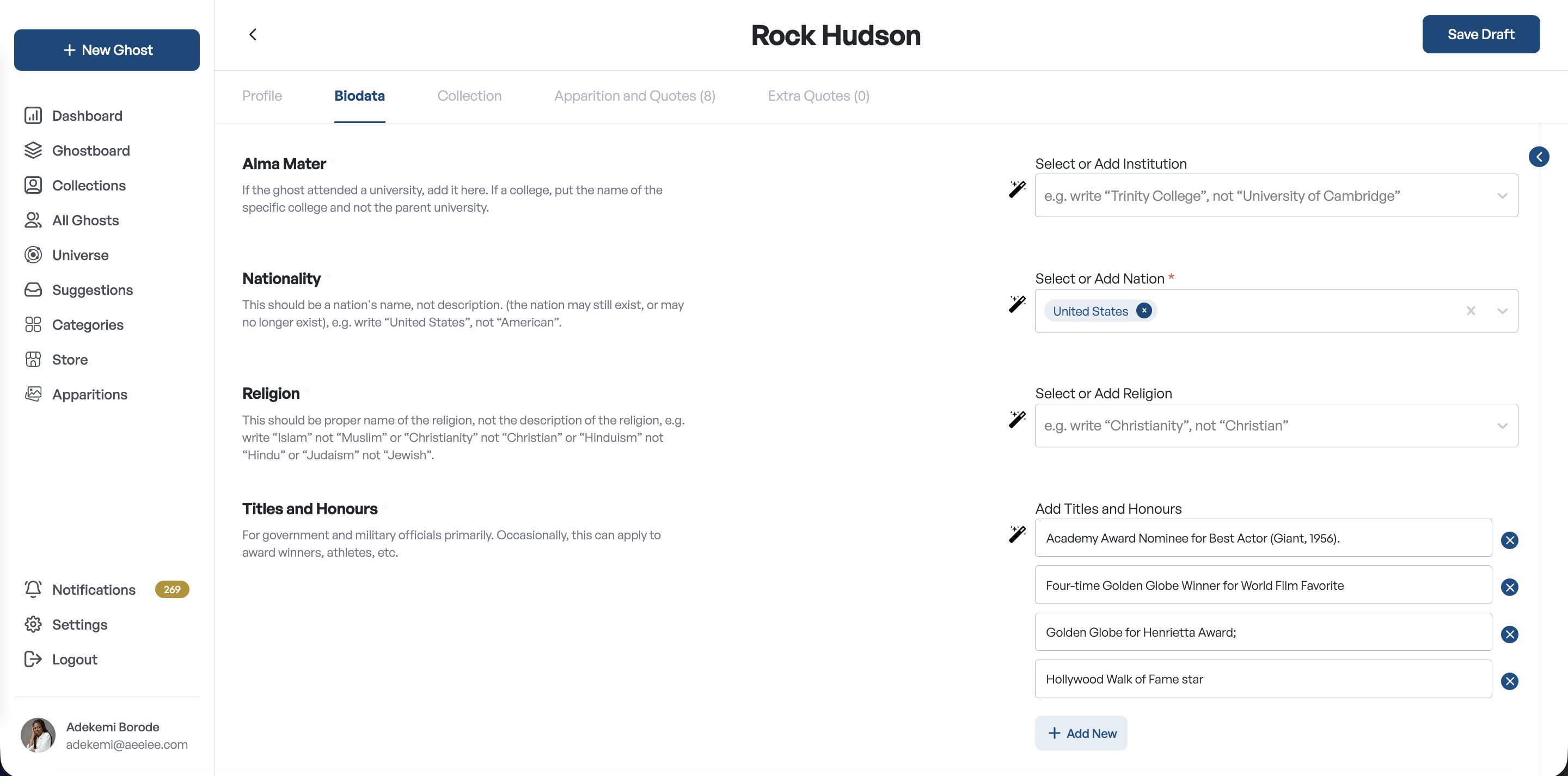
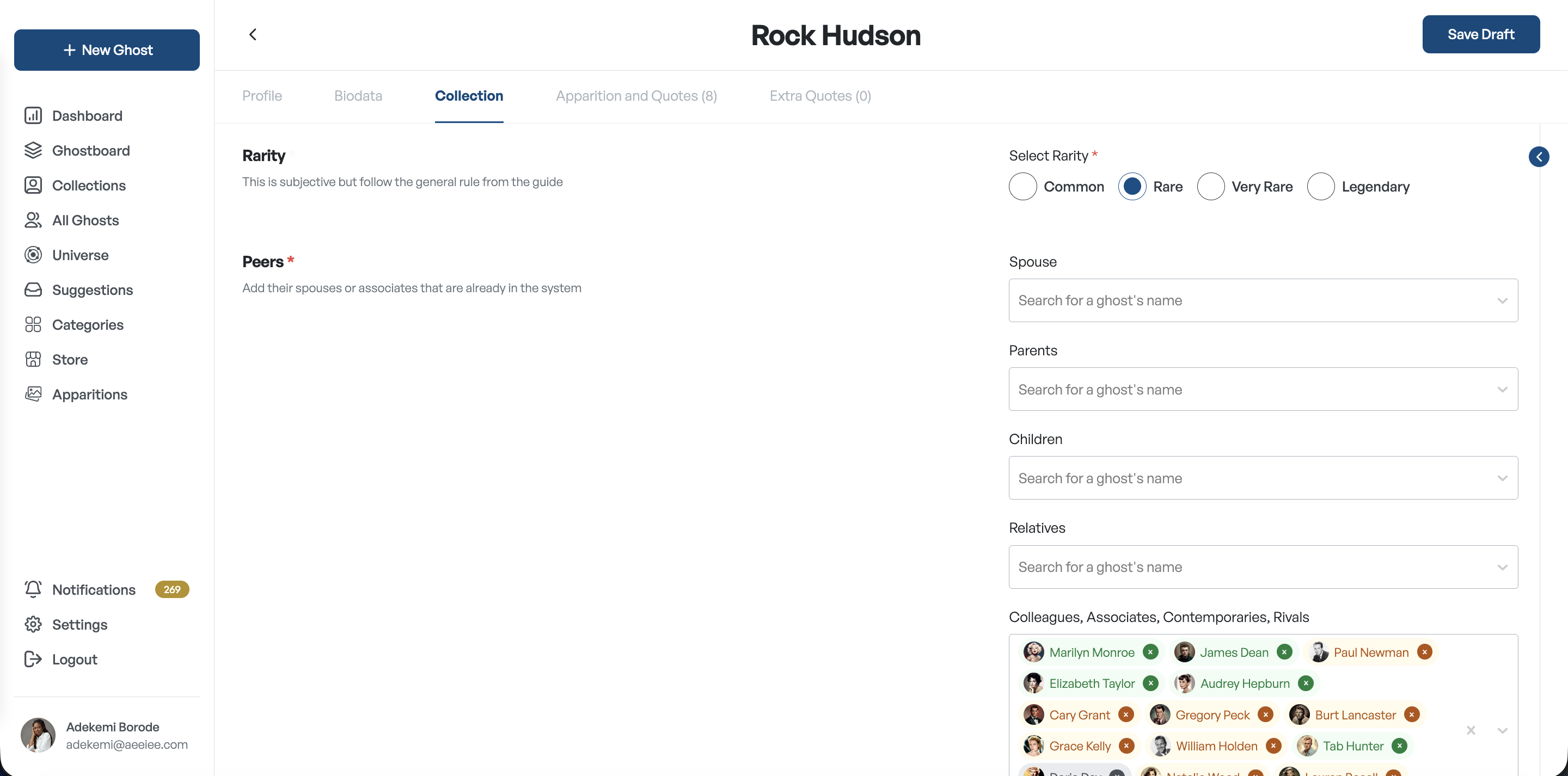
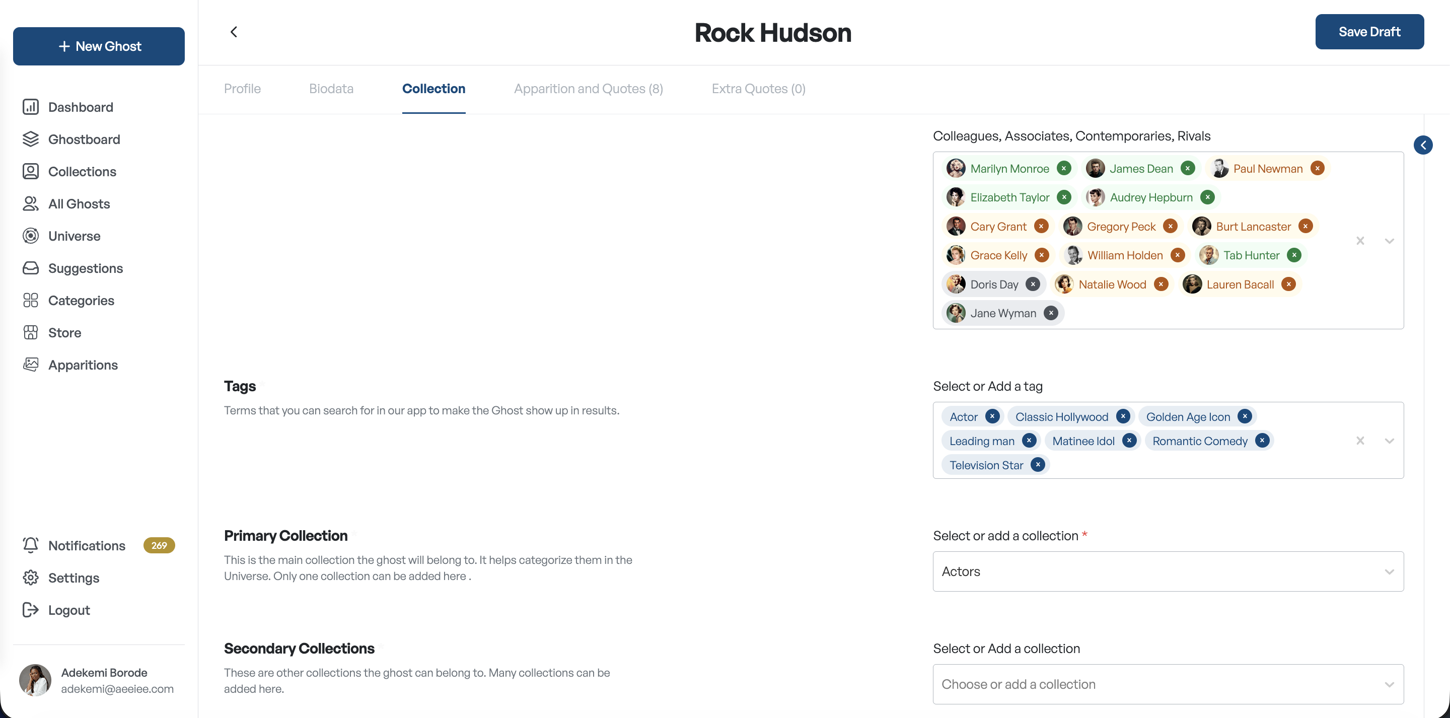
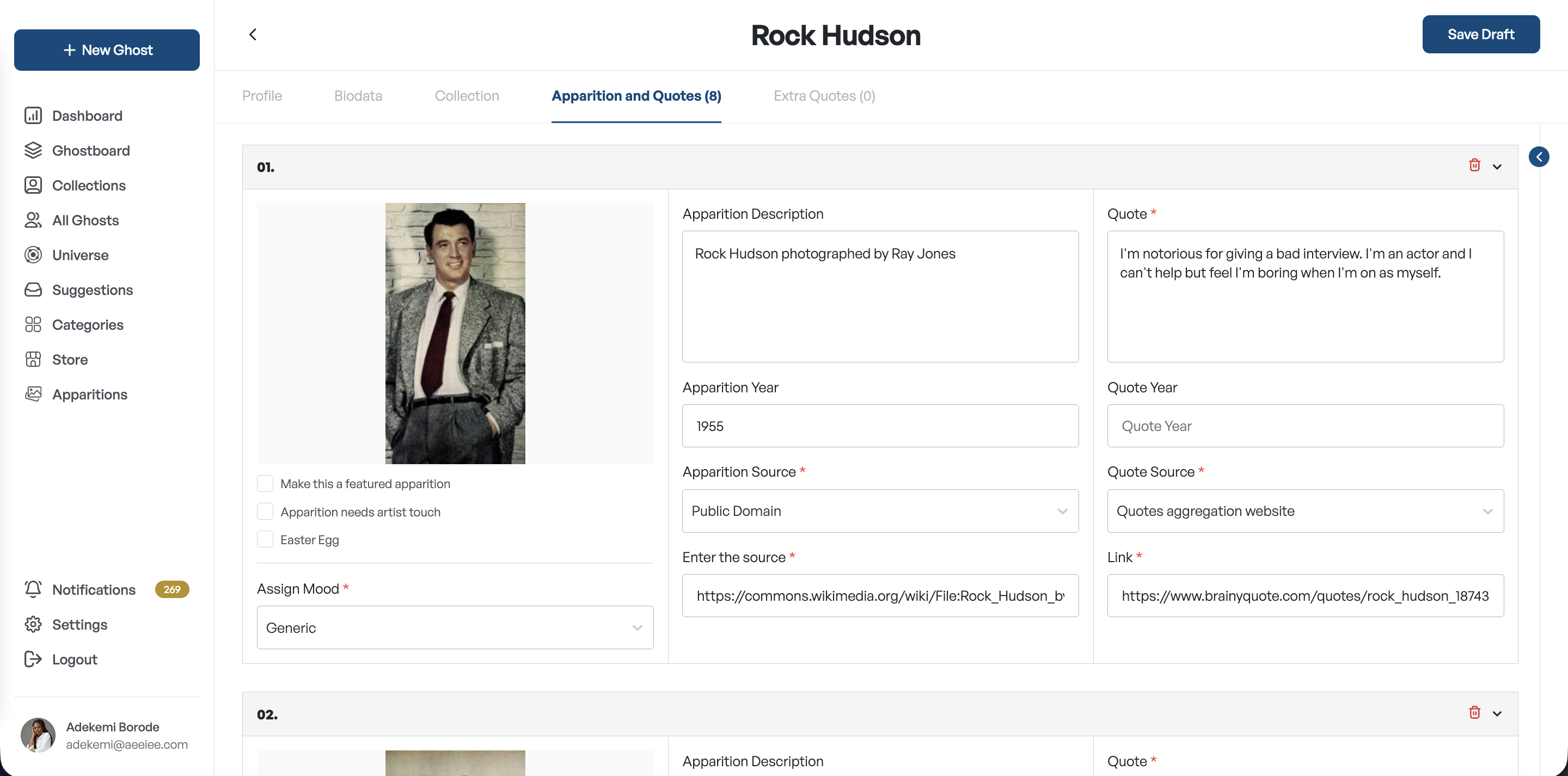
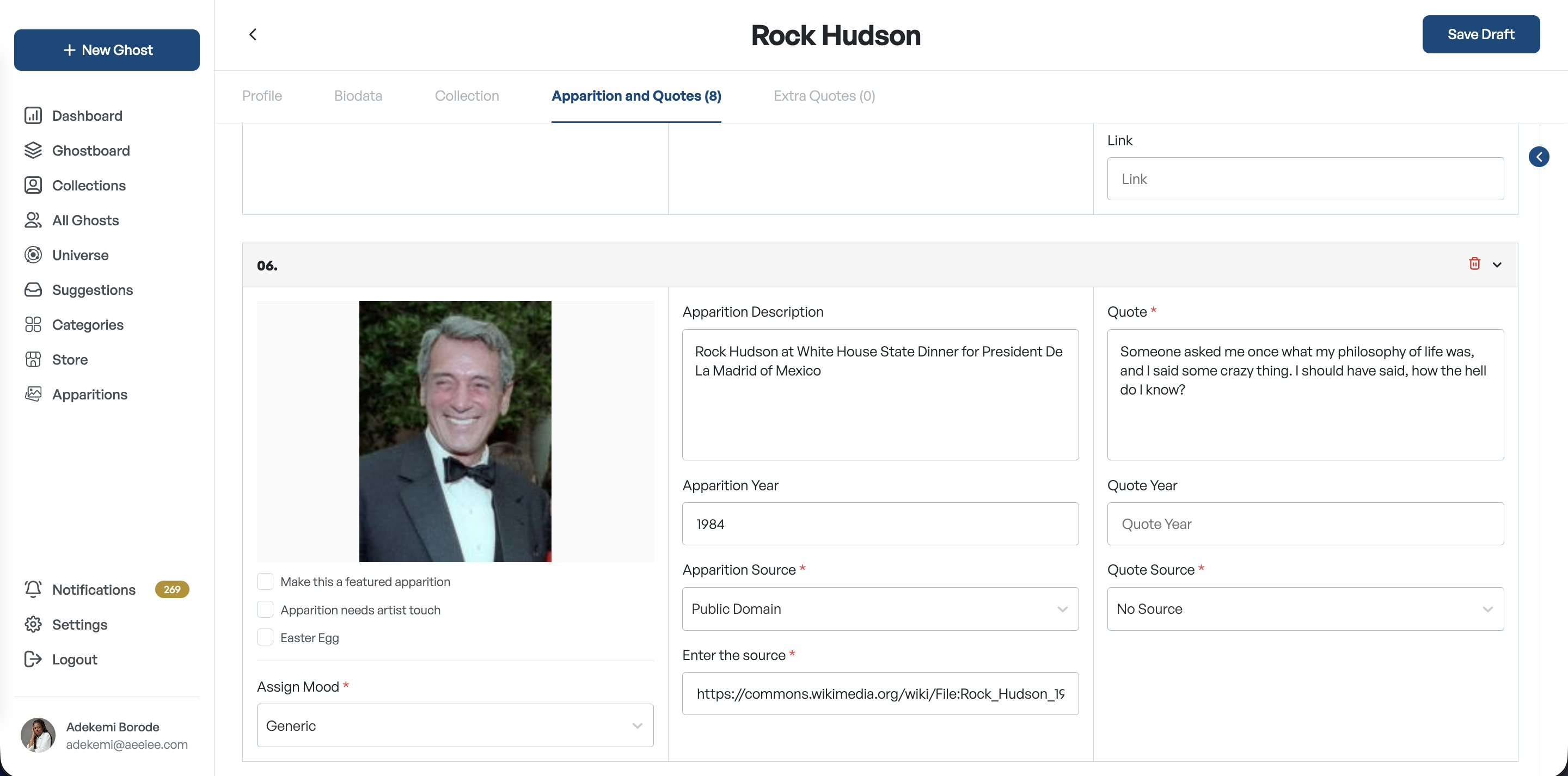
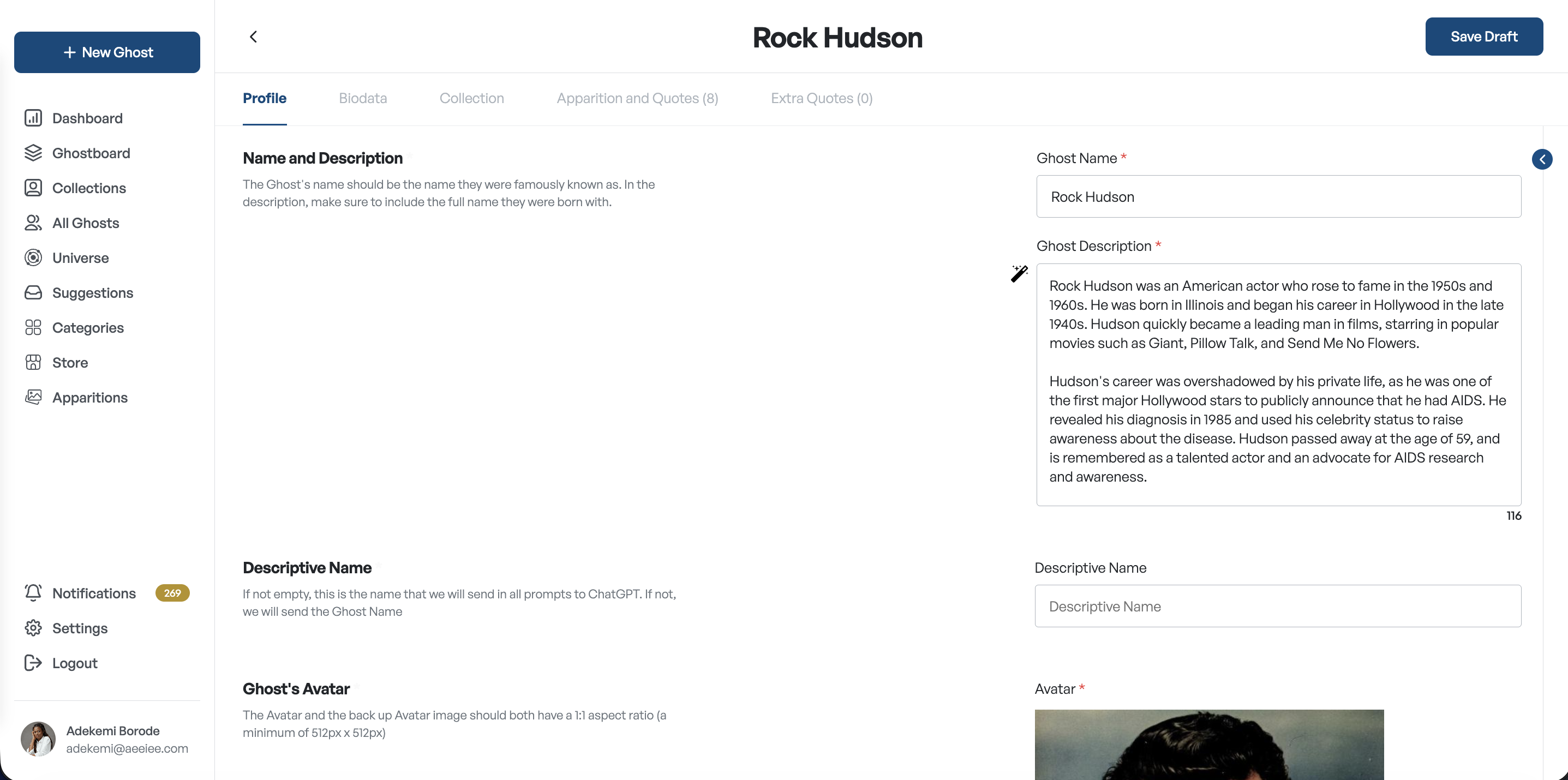
Instead of one long form, I organized Ghost creation into five clearly defined sections with completion tracking โ€” so contributors always know what's done, what needs attention, and whether a Ghost is ready for review. The main app required so much information for a single historical figure, that I had to condense all those info and make it easy for data entry. My major challenge was the Apparitions and Quotes section which was the most important part.
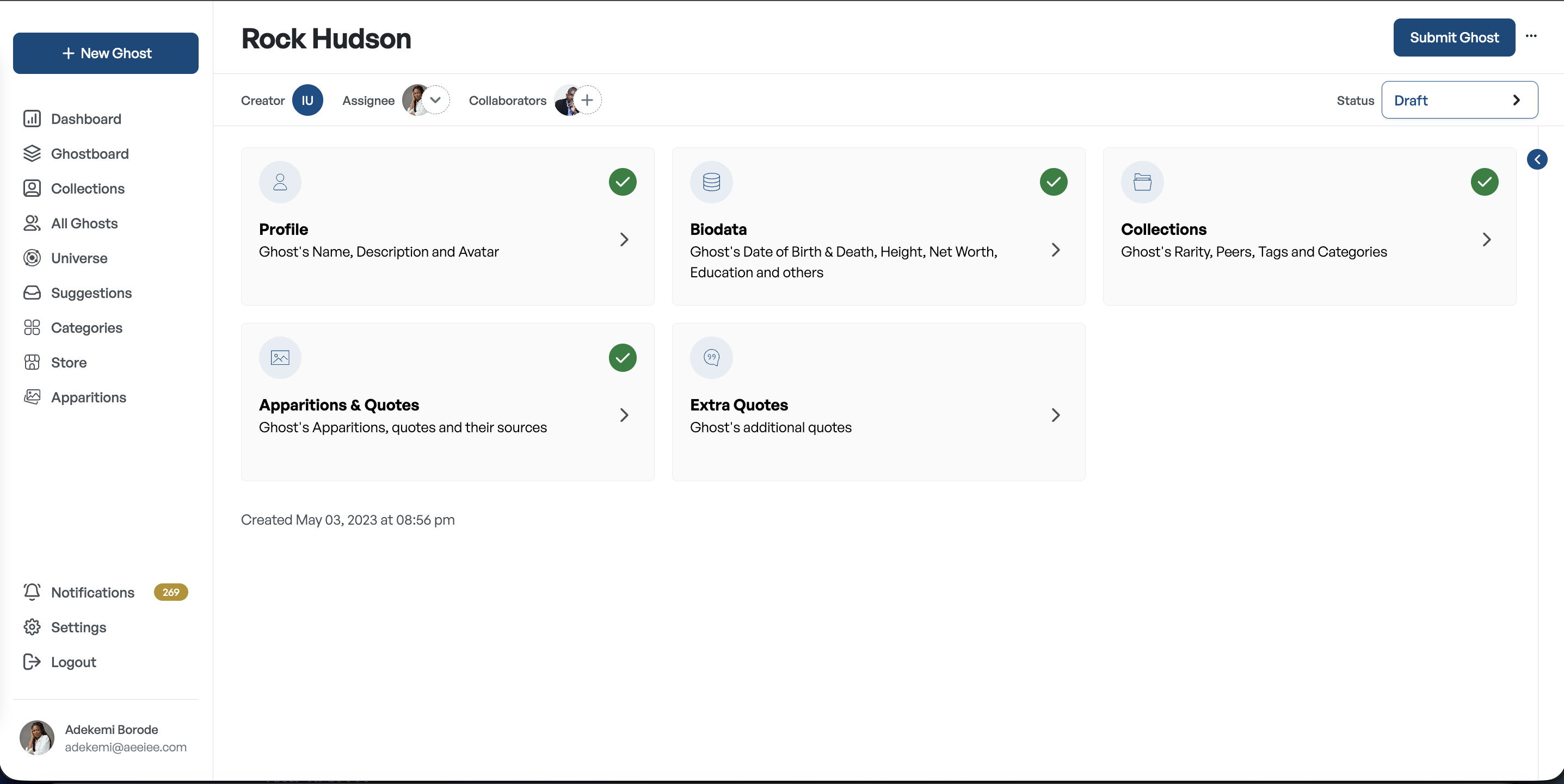
Marie Curie
3 / 5 complete
โœ“ProfileComplete
โœ“BiodataComplete
โœ“CollectionsComplete
โ—Apparitions & QuotesIn progress
Extra QuotesNot started

Bringing collaboration into context

Reviewing used to mean scrolling away from your work to find feedback, then returning and re-establishing context. We introduced a persistent comment panel right beside the editor to view comments while editing, respond immediately, and keep working without losing your place.
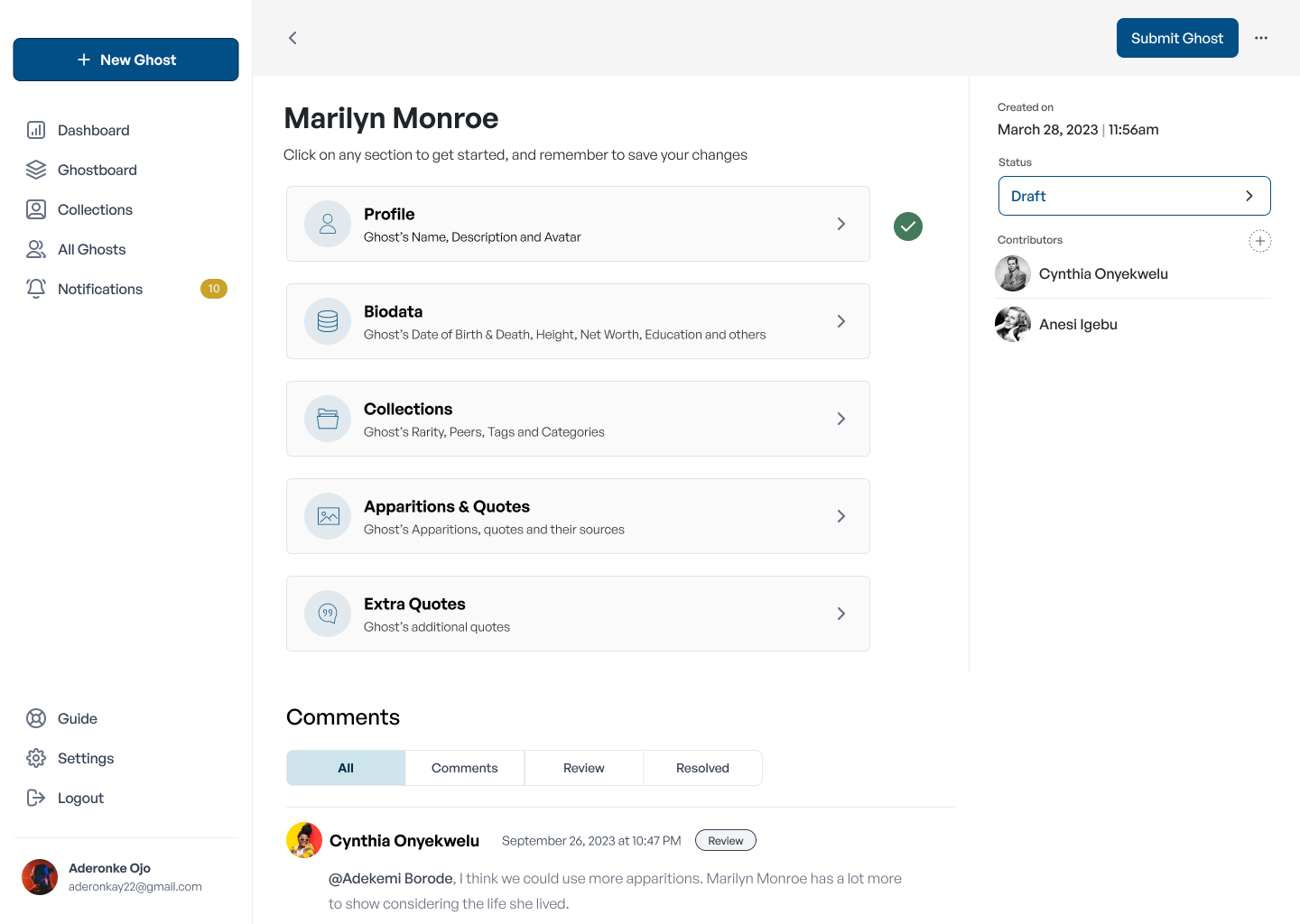
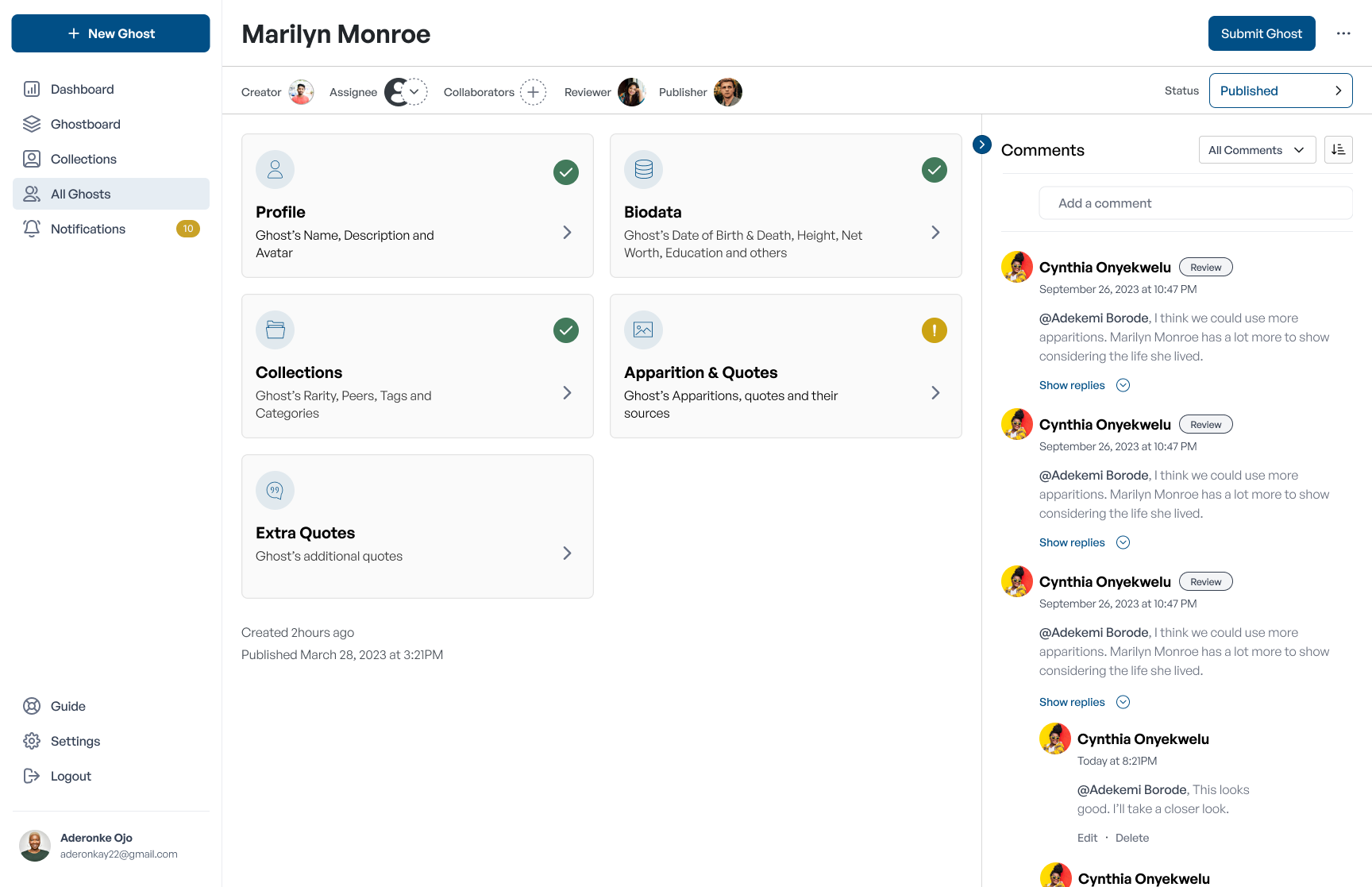
Before โ€” disconnected
Editing the Ghost
โ†•
Comments โ€” below
Comments โ€” before, separate screen
After โ€” side by side
Editing the Ghost
COMMENTS
David
Add a birth year here.
Anesi
Looks good now โœ“
Comments after โ€” side by side view

Replacing a linear flow with flexible navigation

In practice, contributors constantly revisited earlier sections. I redesigned the experience around tab-based navigation, so people can jump between related information and update it efficiently without leaving the workspace.
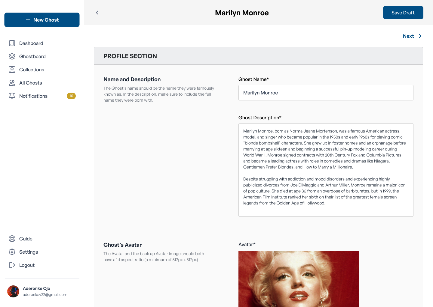
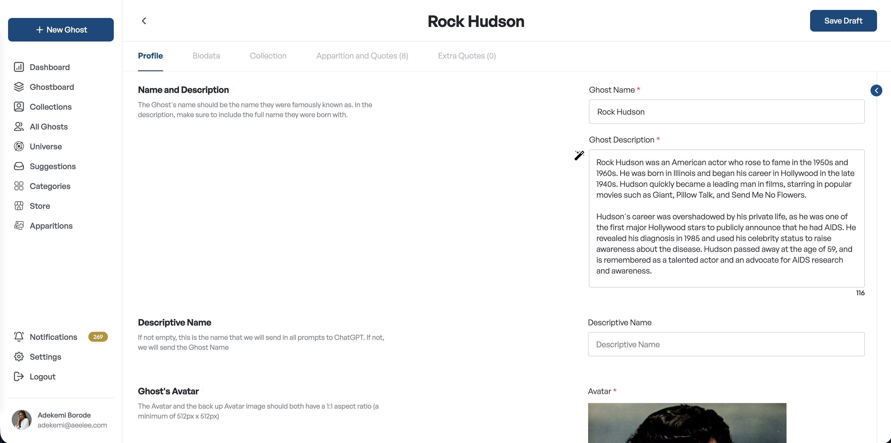
Profile Biodata Collections Apparitions & Quotes Extra Quotes
Before โ€” linear flow
Navigation โ€” before, linear flow
After โ€” tab navigation
Navigation โ€” after, tab navigation
And beyond the workspace

Edit any Ghost from wherever you are

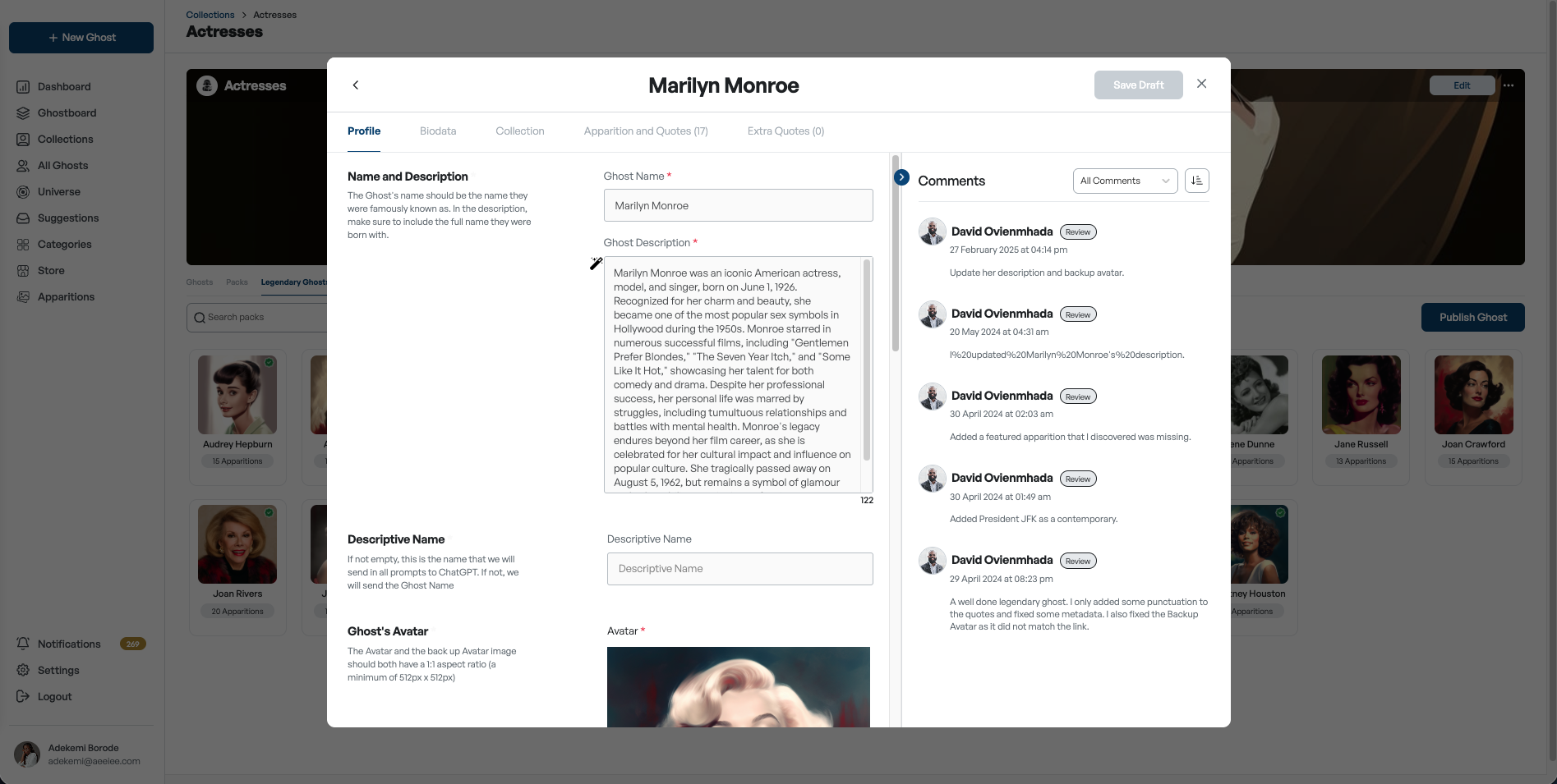
Tabs solved navigation inside the Ghost page but contributors still had to navigate there first. The ghost data itself wasn't easily accessible. As a user, to make any edit, you had to leave your current task, navigate back to the ghost board, search for the ghost, and open its page. We solved this by building a modal system: wherever a ghost's name appears anywhere in the app, clicking it opens a full edit modal right there โ€” no navigation, no lost context.

Ghost modal โ€” edit from anywhere in the app

Clarifying editorial ownership

As more people joined content creation, ownership mattered more. We surfaced roles directly in the workspace, making responsibilities visible and improving accountability across the content lifecycle.

01
Creator
02
Assignee
03
Collaborators
04
Reviewer
05
Publisher

Designing the wider platform

Ghost management was the heart of the design, but I also designed the supporting systems that keep the ecosystem organized and growing.
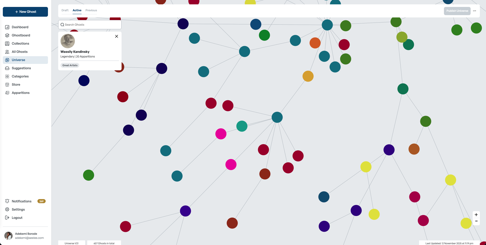
Universe view
Universe

A map of connected historical figures, published into the gamified exploration experience in the app.
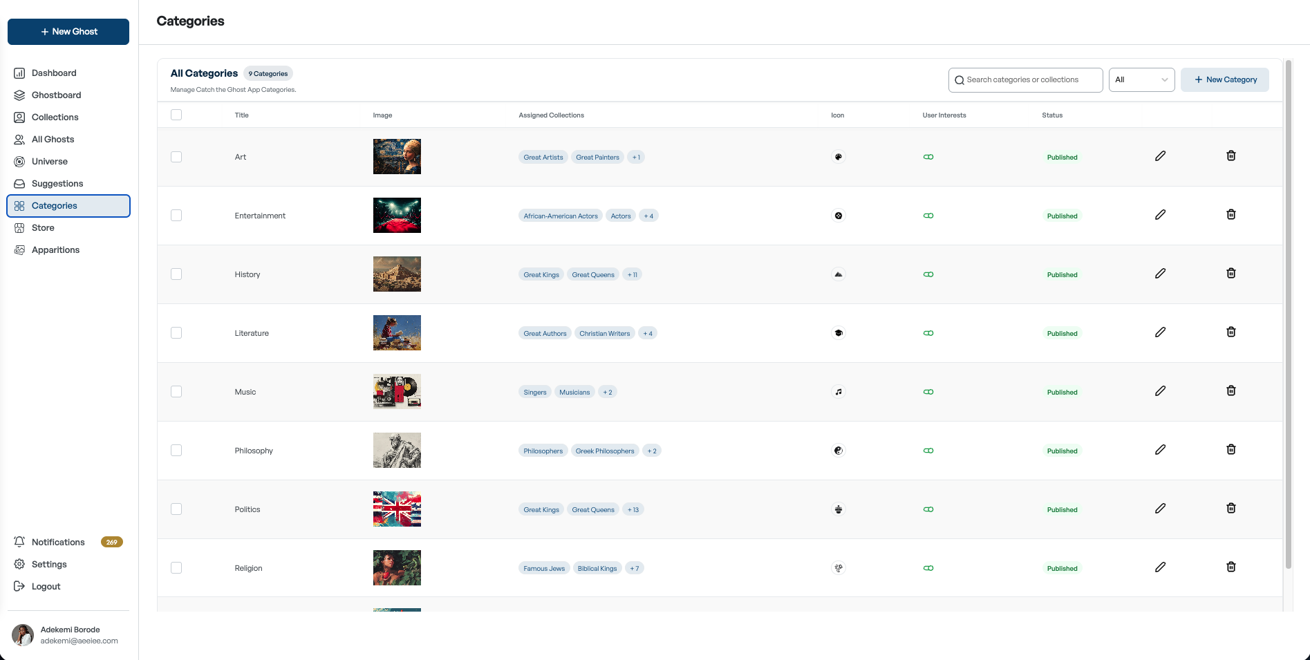
Categories management
Categories

Grouping related collections into broader categories to simplify how user interests are managed.
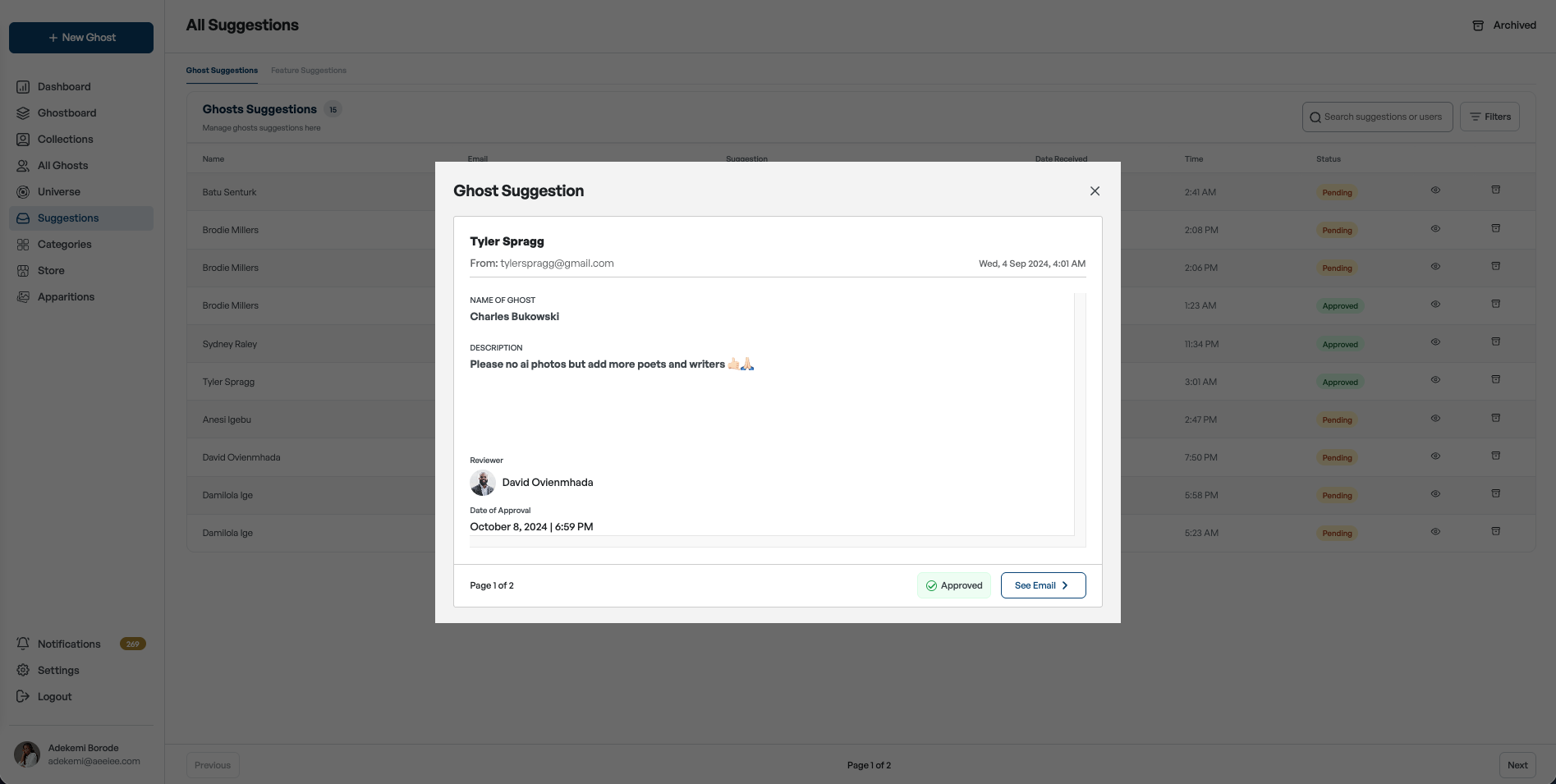
Suggestions moderation
Suggestions

A moderation system to review user submissions โ€” approve, reject, archive, and reply directly to users.
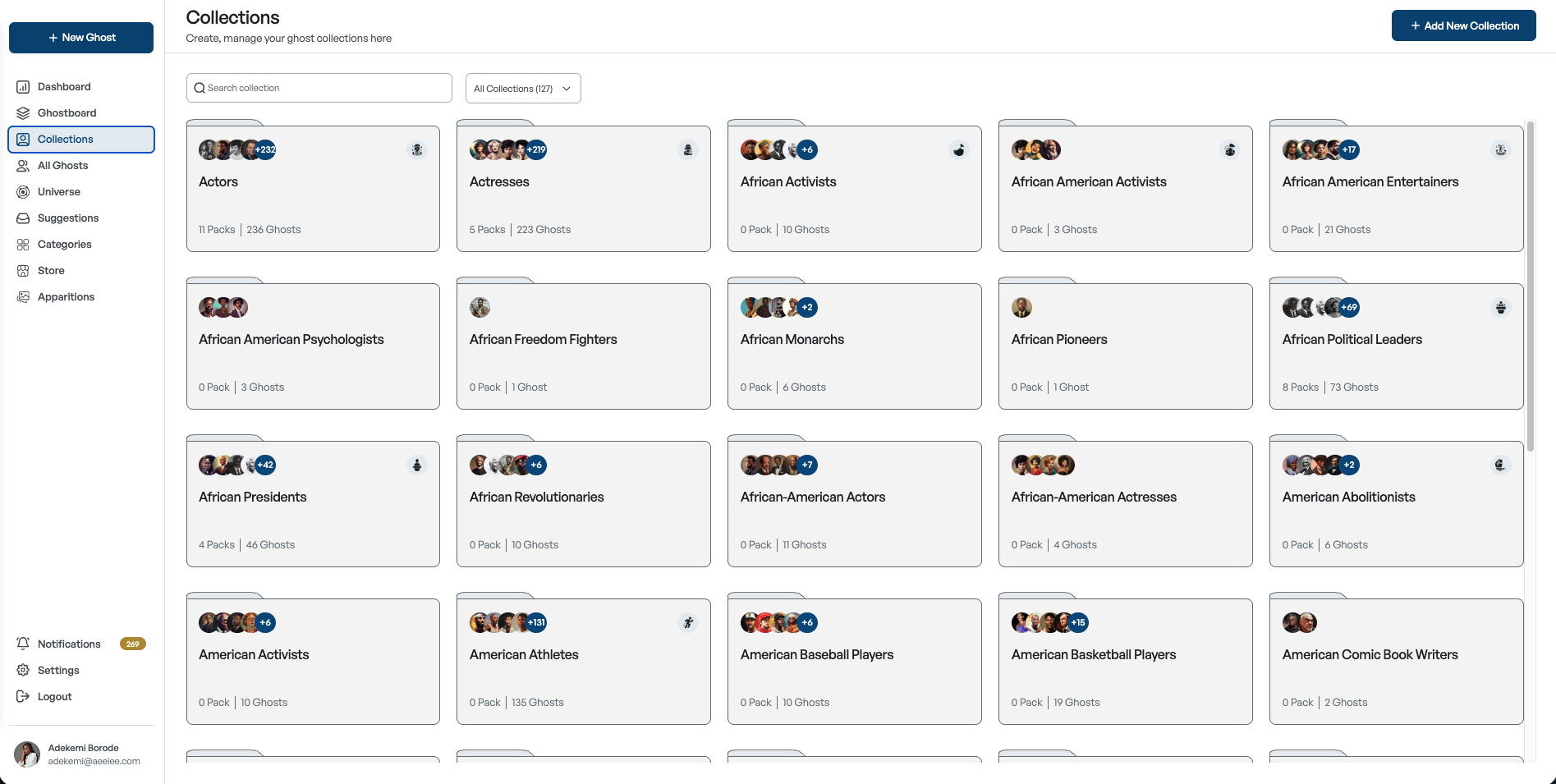
Collections
Collections & Store

Organizing Ghosts into packs and rarity groups, plus admin tools for promotions, discounts, and sales.

Reflection

Designing content management is less about forms โ€” and more about workflows.

The biggest improvements came from reducing context switching, clarifying ownership, and helping contributors understand progress. Rather than adding new functionality, the redesign made existing tasks easier, faster, and more intuitive โ€” a more scalable experience that grew with the Catch the Ghost ecosystem.

Contact

Let's build products people love to use.

If you have a new idea, a product to improve, or an interesting problem to solve, I'd love to hear about it.