Adekemi Borode ShowApp
Case Study 03 — Personal Project

ShowApp

A faster, more reliable way for moviegoers to find accurate cinema showtimes.
Role
UX Designer
Type
Personal · Mobile App
Timeline
Nov 2021
Status
Concept · Not shipped yet
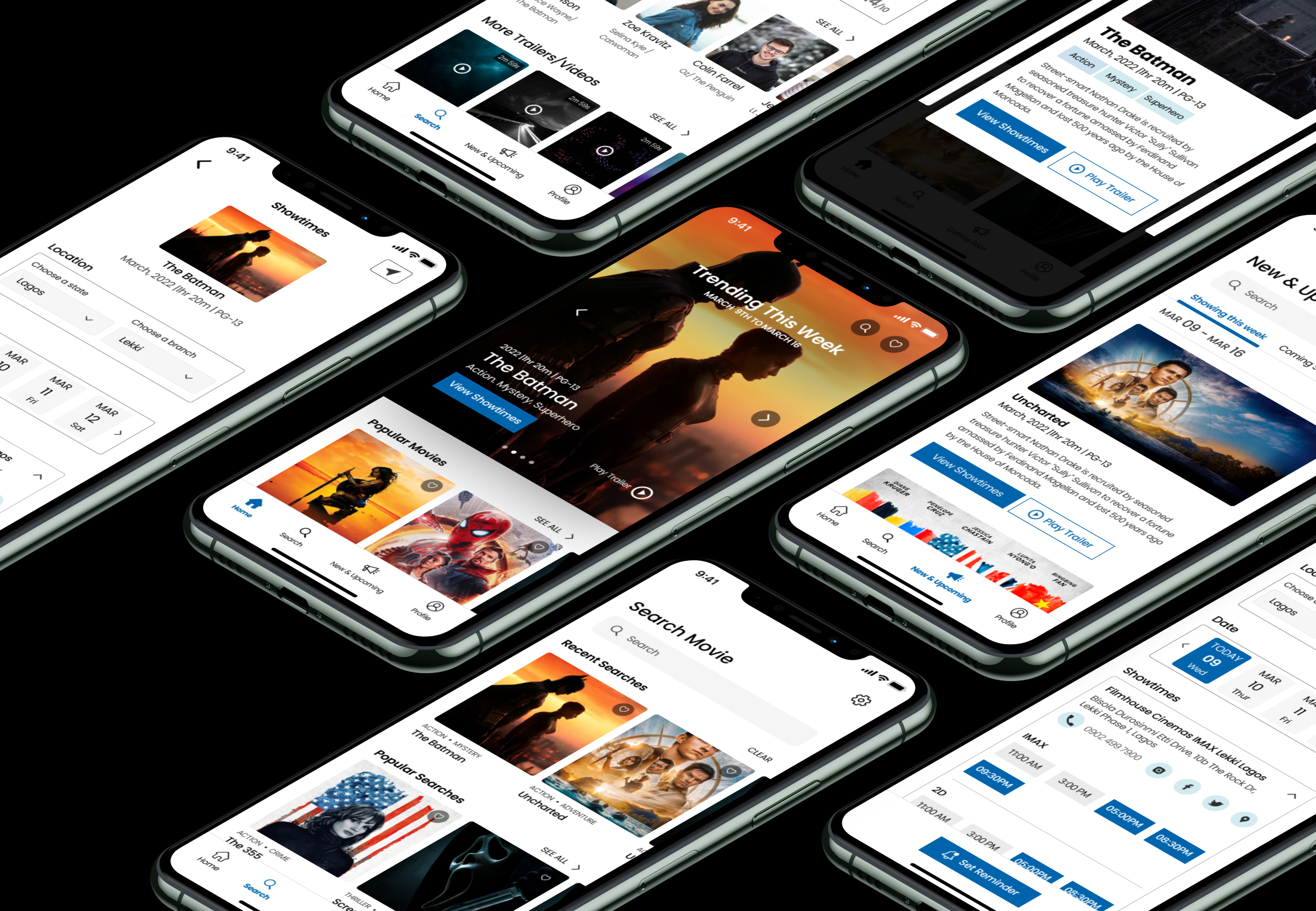
ShowApp screens shown across multiple iPhone mockups

MovieHouse Cinema shows the latest films across many branches, and wants to improve the movie-viewing experience for its customers.

Their audience — film buffs and social moviegoers who love exploring new releases — needed a more dependable way to plan a trip to the cinema. ShowApp is my concept for solving that.

My contributions

User research and interviews, paper and digital wireframes, low- and high-fidelity prototypes, usability studies, accessibility considerations, and design iteration.

There's no straightforward way to check showtimes

Through interviews, I found people often visit several websites just to look for a showtime, and the process is tiring. Worse, times are sometimes inconsistent because sites aren't updated — so a user can arrive at the cinema only to find they followed the wrong time. Many wanted a reliable alternative just to confirm.

How might we

…give moviegoers one trustworthy place to check accurate showtimes — so they can plan ahead and never miss a scene?

What I heard from users

01
Non-user-friendly websites
Existing cinema sites are difficult to navigate.
02
Too much scrolling
Users scroll endlessly just to view a showtime.
03
Inconsistent updates
Website times don't match the cinema, and users aren't told.
04
Showing up at the wrong time
Inconsistent updates lead to missed or wrong screenings.

Meet Zara

Problem statement

Zara is a YouTuber who reviews movies and needs to view accurate showtimes online, because she wants to plan ahead, arrive early, and not miss a single scene.
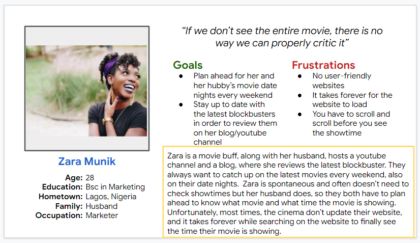
User persona — Zara Munik, 28, marketer and movie reviewer in Lagos

Mapping Zara's path to the cinema

A customer journey map helped me locate the moments of friction and where a single reliable source of showtimes would matter most.
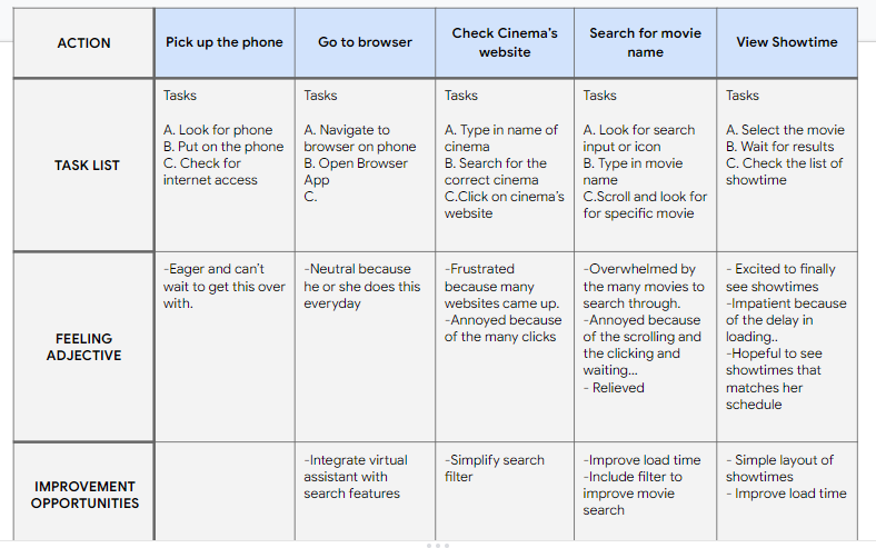
Customer journey map across five stages

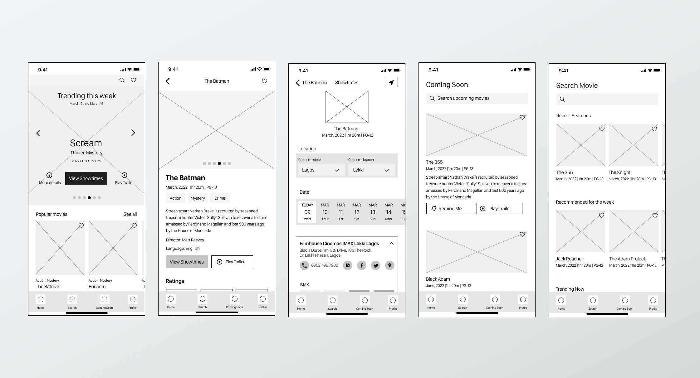
From paper sketches to digital wireframes

Digital wireframes for five core ShowApp screens

The high-fidelity design

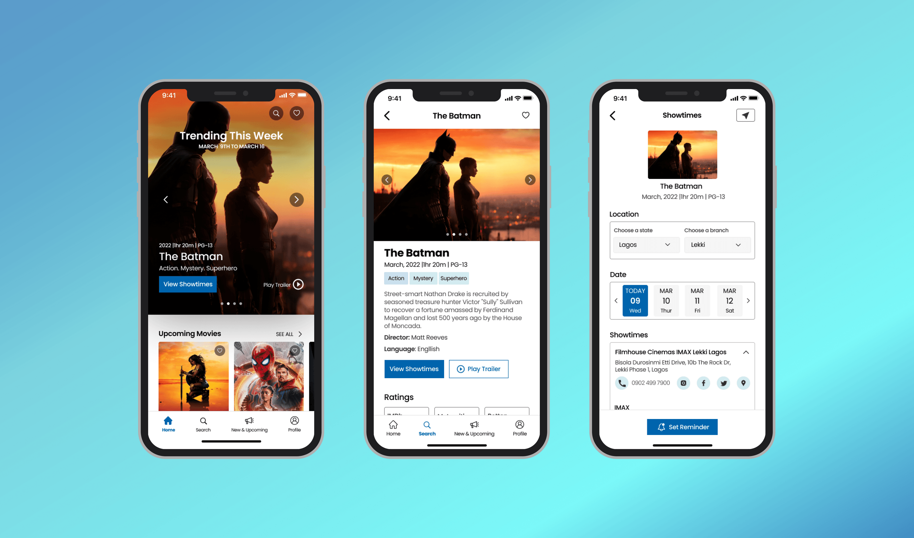
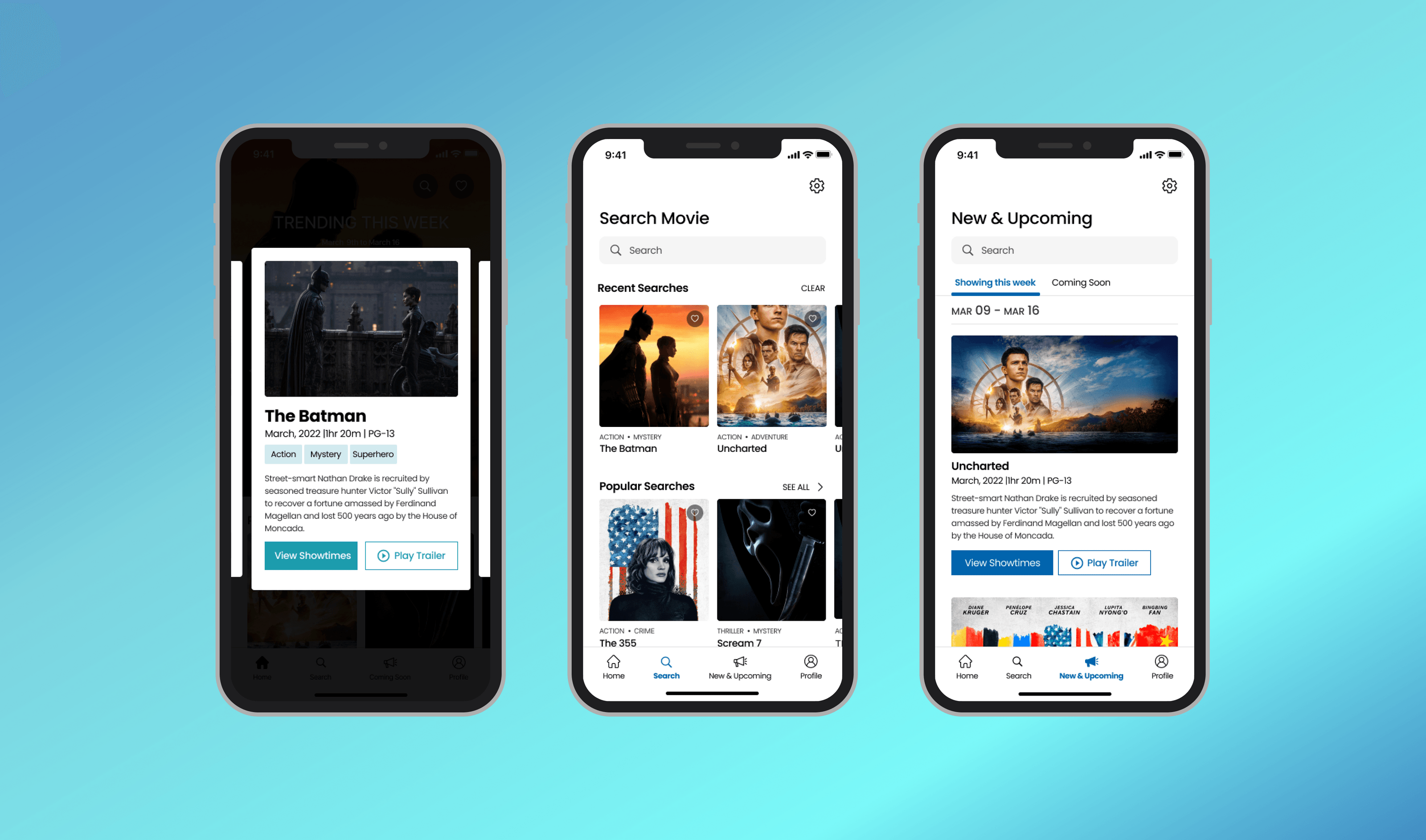
A clean, scannable interface that puts accurate showtimes one tap away — trending films, a fast search, and a simple branch-and-date showtime flow.

How the design solves each pain point
Pain Point 01 Non-user-friendly website

"Existing cinema sites are difficult to navigate — users aren't sure where to find what they need."
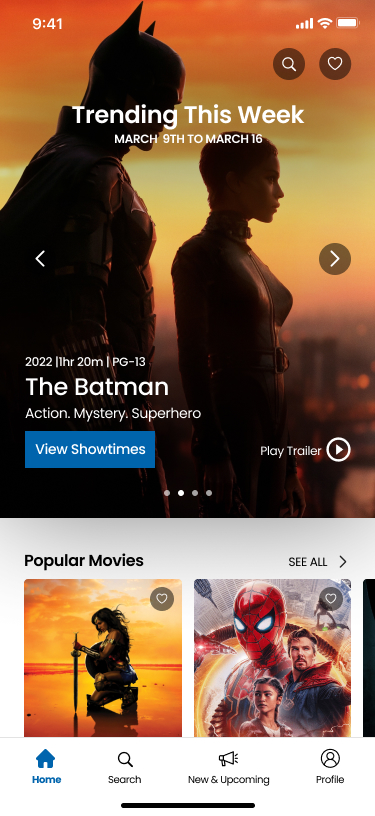
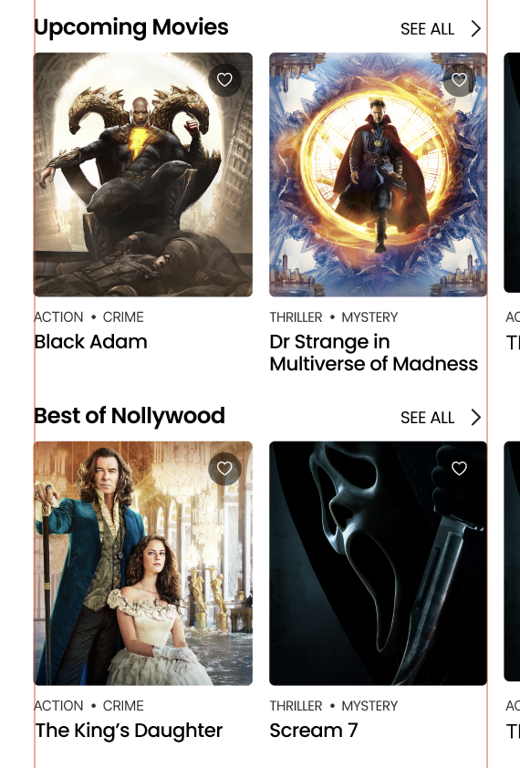
Homepage
Search page
↑ Structured homepage sections
Structured homepage sections
1
Clear bottom navigation
Always visible — Home, Search, New & Upcoming, Profile — so users always know where they are.
2
Structured homepage sections
Trending, Popular, Upcoming, Nollywood — clearly segmented so users never guess where to look next.
3
Search with memory
Recent and Popular Searches surface familiar patterns immediately, reducing friction from the first tap.
Pain Point 02 Too much scrolling to find showtimes

"Users scroll endlessly just to view a showtime — the process is exhausting."
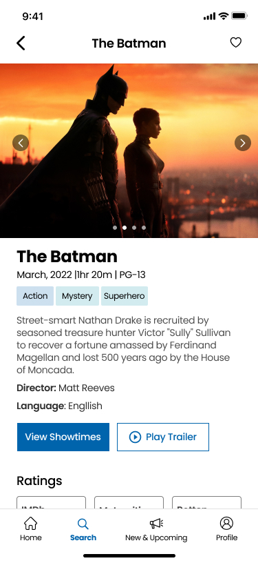
Movie detail page
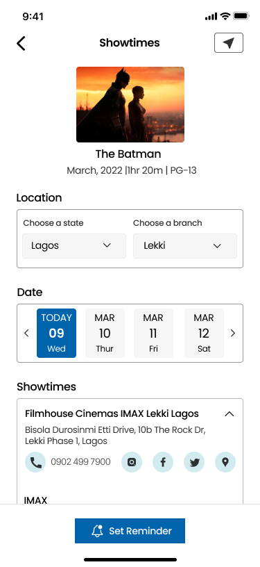
Showtimes screen with date tabs
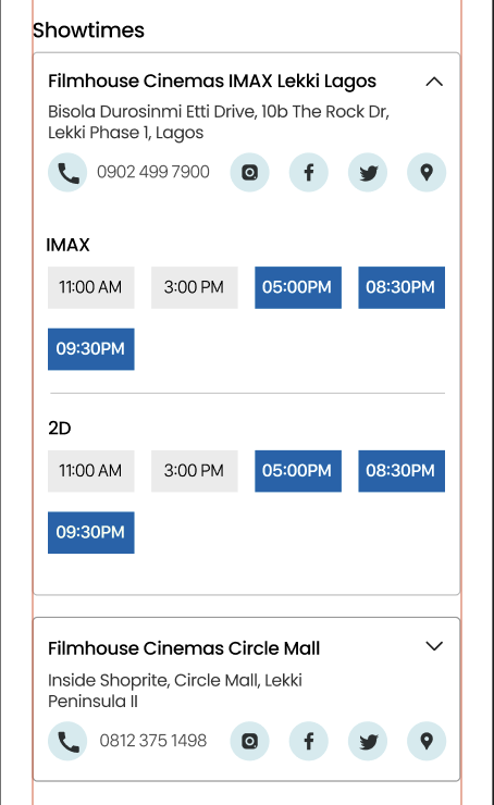
↑ Scannable time grid
Scannable time grid
1
"View Showtimes" CTA
Prominent and above the fold on the movie detail page — showtimes are one tap away, no hunting required.
2
Date selector tabs
Compact, scrollable date tabs let users jump between days instantly — no scrolling past irrelevant times.
3
Scannable time grid
Time slots shown in a compact grid per cinema — all the options visible at a glance, not buried in a long list.
Pain Point 03 Inconsistent website updates

"Website times don't match the cinema — and users are never told when something has changed."
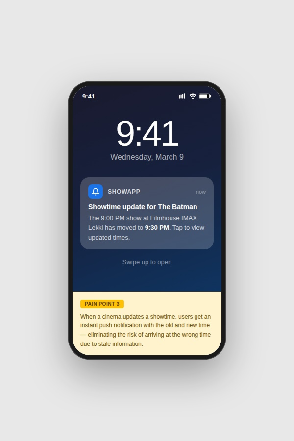
Lock-screen push notification
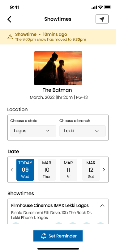
Showtimes screen with amber alert banner
1
Instant push notification
When a cinema updates a showtime, users receive an instant push notification with the old and new time — eliminating the risk of arriving at the wrong time due to stale information.
2
Amber alert banner
An amber alert banner at the top of the Showtimes screen confirms when a time has recently changed — users see the update the moment they open the page.
3
"NEW" badge on updated slot
The 'NEW' badge on the updated time slot makes the change impossible to miss while scanning — no guessing which time is different.
Pain Point 04 Showing up at the wrong time

"Inconsistent updates lead users to arrive at the cinema at the wrong time — a costly, frustrating mistake."
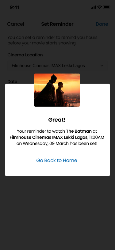
Set Reminder confirmation
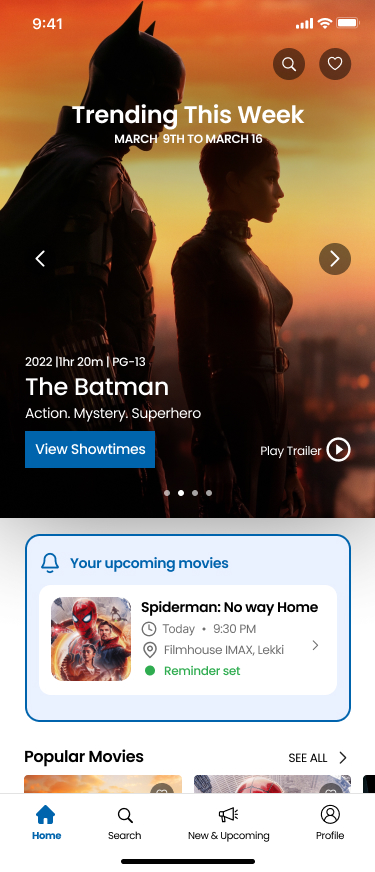
Home screen with upcoming reminder card
1
"Set Reminder" on the showtime screen
Placed directly on the showtimes screen — users set a reminder the moment they find a time they want, making ShowApp the trusted source they rely on.
2
Confirmation with full details
The confirmation modal shows movie, cinema, date and exact time — users know precisely what they committed to, eliminating confusion before they leave home.
3
Persistent reminder card on home screen
A persistent reminder card on the Home Screen shows the upcoming movie, time, and cinema at a glance — so users always know their show details without having to search again.
Full hi-fidelity mockups
High-fidelity mockups — trending home, movie detail, and showtimes
High-fidelity mockups — quick-view modal, search, and new & upcoming
Conclusion

Iteration and testing are the parts of design I most want to prioritize.

What I learned

Iteration and testing are an essential part of the design process — not a final step. This project sharpened how I validate decisions with real users.

Next steps
More user research into the problem space
More usability testing & iterations
Hand-off to the development team
Contact

Let's build products people love to use.

If you have a new idea, a product to improve, or an interesting problem to solve, I'd love to hear about it.